Mister.Hill
New Member
- Joined
- Sep 25, 2005
- Messages
- 26
Is this better
Is this better
Hi Laurenb,
Thank you so much for your feedback - I tried to post an update to this, but I think it was the wrong forum area.
Based on your comments below I am trying to make my personal website a little easier to read. Hopefully it's not to "simple" now you can see the changes at www.abalonepearls.co.nz
Again, any feedback is appreciated while I try my best to learn. I'm still working on it, so not all the images are up yet... It's slow work when you're learning.
Thanks and kind regards.
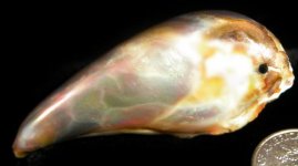
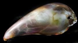
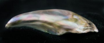
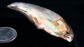
The pendants are beautiful!
A respectful suggestion about your Web site (because it seems to be in the late stages of ongoing construction (the "click here links") ? your background is a bit dark. I find that the text is still readable, but it does not stand out. Likewise, the colors of your pearls don't pop, but seem a little swallowed. Saturated backgrounds with darker text is a dated design convention that may not be in line with goods of the quality and price you're featuring.
It's very oceany ? I see why that color was chosen and see why you might elect to keep it, but I thought I'd mention it. Thank you for sharing this with us and good luck with auctioning, if you decide to go that route!


